Overview
- Walgreens, Advil, and CVS have the most identifiable logos in healthcare.
- Tylenol is the most identifiable pain reliever among Baby Boomers and Gen X, and Advil is the most identifiable among Millennials and Gen Z.
- 62% of men can identify the Tampax logo.
It can be hard to decide what to name your independent practice or clinic and how to present that brand to the world. We decided to explore branding and memorable visuals in the medical space that have stood the test of time over the years. From medicines to storefronts, here are some interesting takeaways from our research.
Some brand logos are more eye-catching than others. But which ones do people remember?
To find out, Tebra surveyed people from across the United States, showing them a series of logos from medical providers, common consumer brands, and medical products and services - and had them guess the brands. We also gave them a brand name and asked them to draw what they thought the logo looked like. Read on to see how they did and to learn more about what makes a healthcare logo memorable.
Key takeaways
- Walgreens, Advil, and CVS have the most identifiable logos in healthcare.
- Tylenol is the most identifiable pain reliever among Baby Boomers and Gen X, and Advil is the most identifiable among Millennials and Gen Z.
- 62% of men can identify the Tampax logo.
Healthcare logo recognition
To start, we wanted to know which brands had the most and least recognizable logos overall.
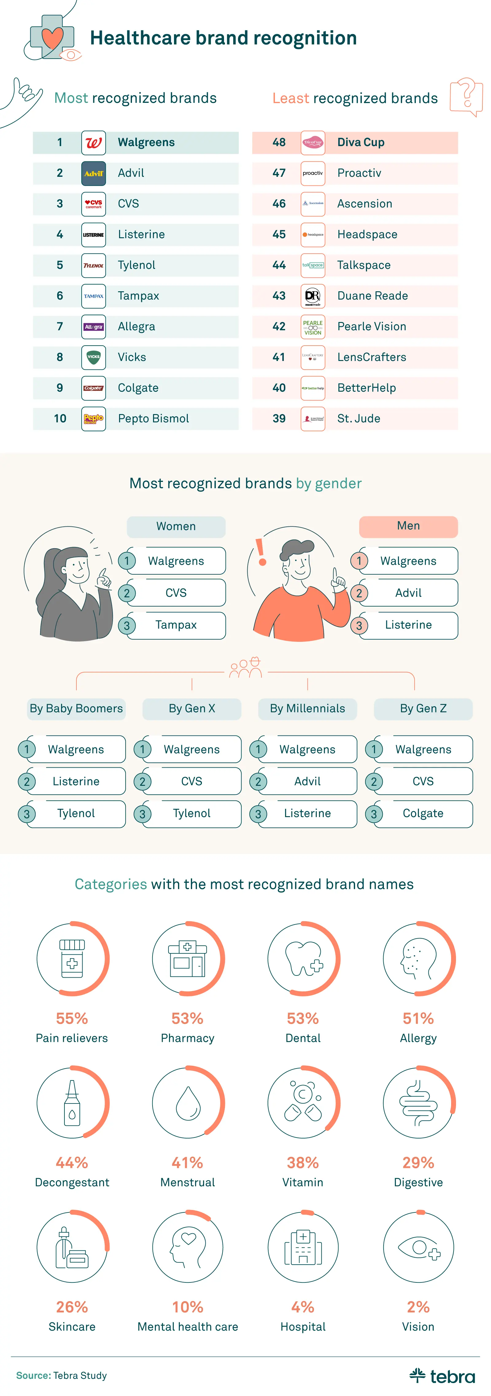
Walgreens topped the list as the most recognizable healthcare logo, followed by Advil and CVS. When we analyzed our results further, we found that Walgreens was also the most identified logo by all genders and generations surveyed.
Similarly, pain relievers and pharmacies were also the two brand categories that respondents had the easiest time identifying. Branding plays an important role in consumer choice, so we wanted a deeper look into which medications stand out most to consumers and why.
Bottle brands: standing out in the aisle
Drug store medications mainly compete for customers’ attention against the few others that treat similar symptoms. So, we looked at different medication types to see which ones were the most memorable to our respondents compared to one another.
Memorable medicines recognizability
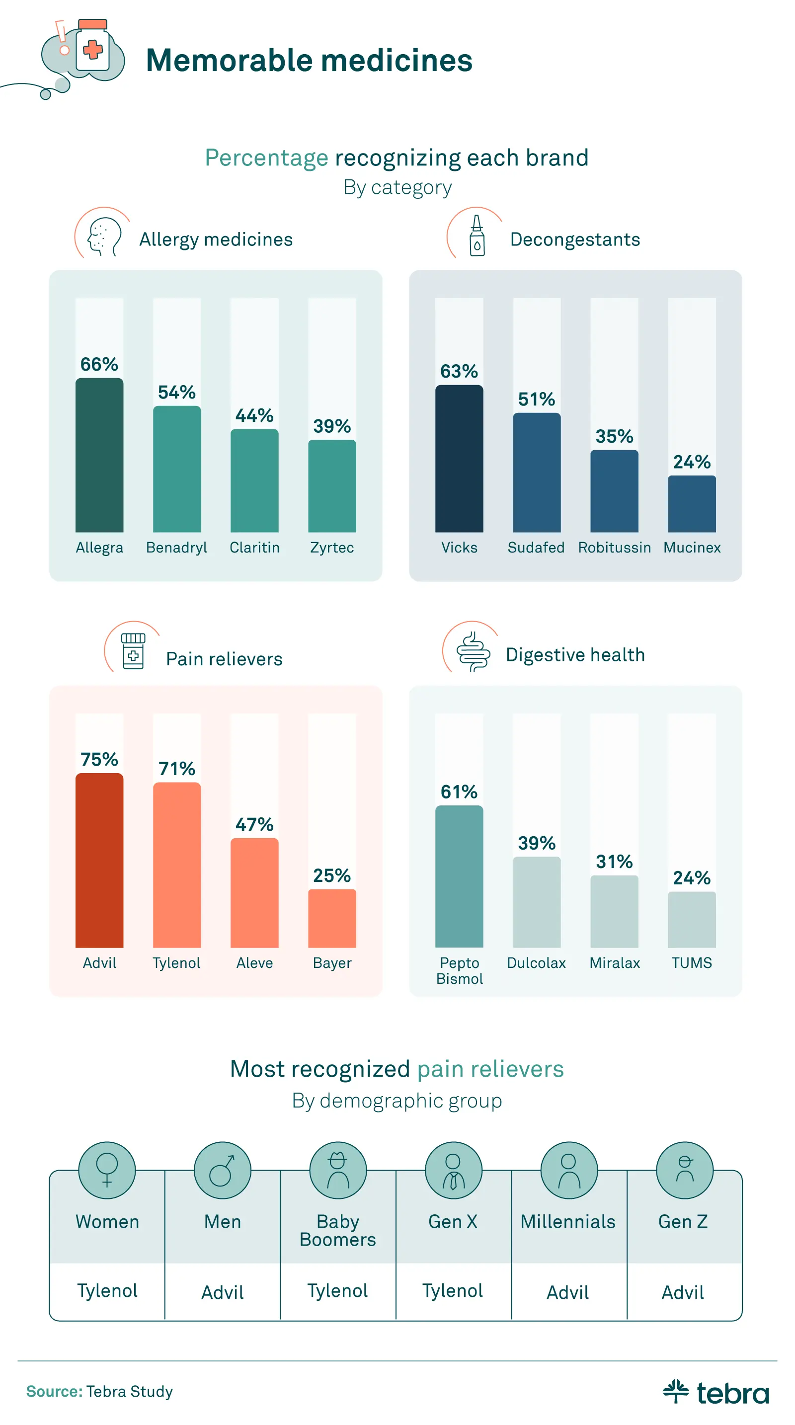
Allegra was the most recognizable logo of all the popular allergy medications we studied. This may be attributed to Allegra’s logo being the only purple one, while those of the remaining three brands are predominantly blue or green.
Pepto Bismol was the most memorable of the digestive health medications — again, likely due to its unique color (a distinctive pink and bright yellow). Some studies have noted that Pepto Bismol’s color may positively influence how consumers perceive the product’s strength and effectiveness.
The battle for the most recognizable pain reliever brand was the closest, with Advil narrowly beating Tylenol. However, Tylenol’s logo was the one most recognized by women and older generations, while men and younger generations were more likely to recognize Advil’s.
But it’s not just the packaging that distinguishes these two medications. Acetaminophen and ibuprofen — the active ingredients in Tylenol and Advil, respectively — each have their benefits and drawbacks to consider when it comes to pain relief.
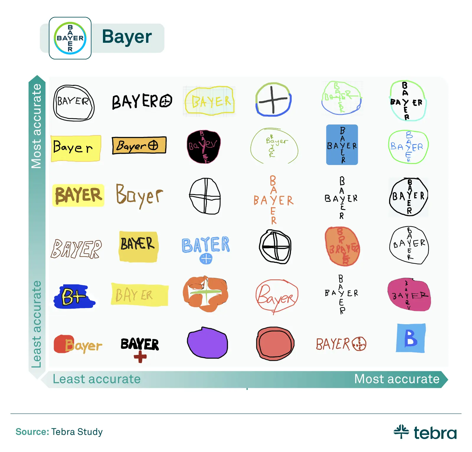
We went beyond asking our respondents to identify brand logos, to see how well they could draw them from memory. Bayer was not only the least-identified pain reliever based on their logo — many respondents also misremembered their logo design when prompted. A significant number drew the old yellow Bayer bottle instead of the company’s current cross logo - a reminder that medical rebranding can be tricky.
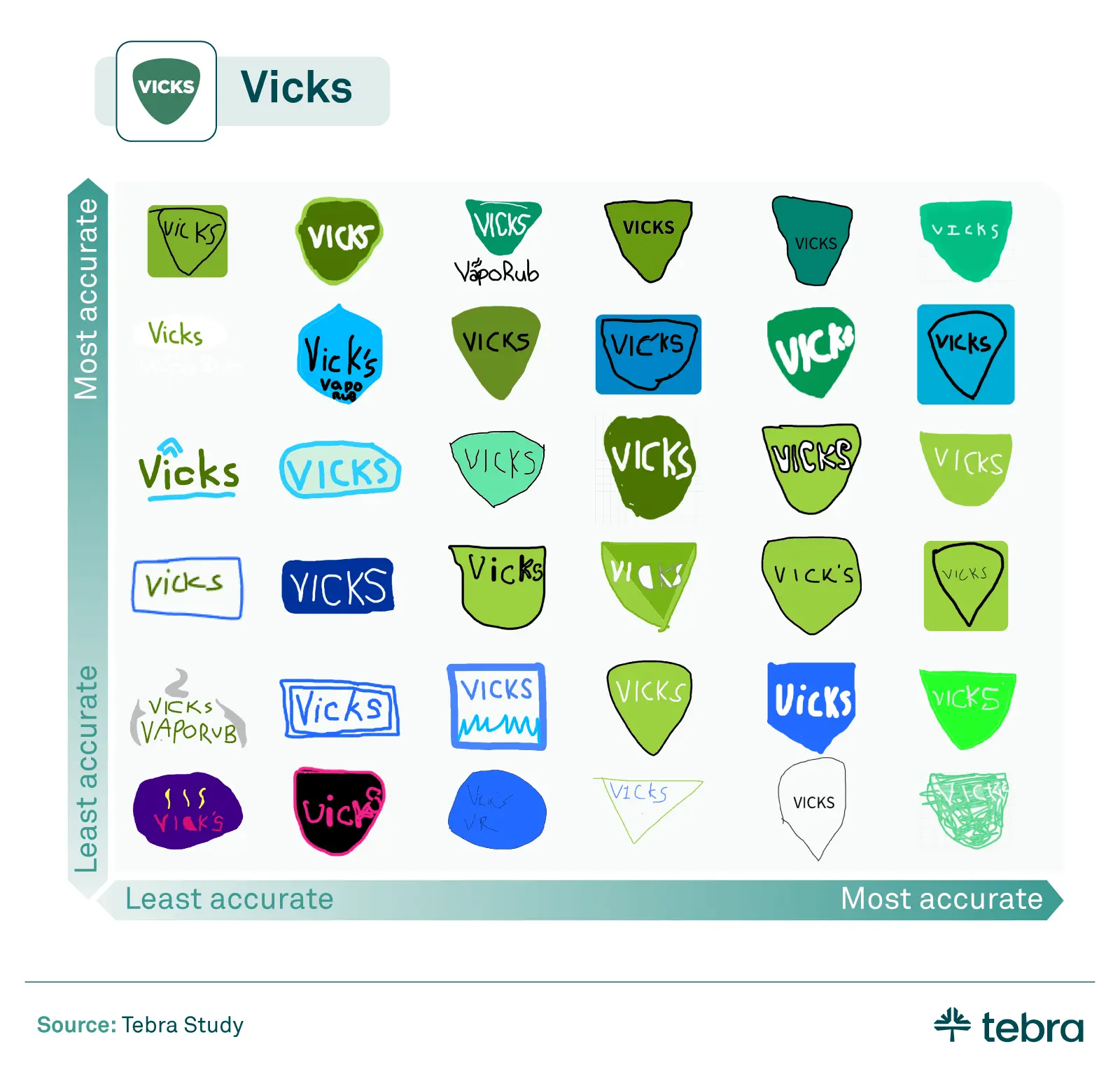
The shape of the Vicks logo (perhaps best known for its place on their popular VapoRub product) proved a bit easier for respondents to recall, even if most of them didn’t get the exact shade of green right.
Aside from medications, we also determined which other types of healthcare products had the most memorable branding.
Recognizableness of popular U.S. healthcare products
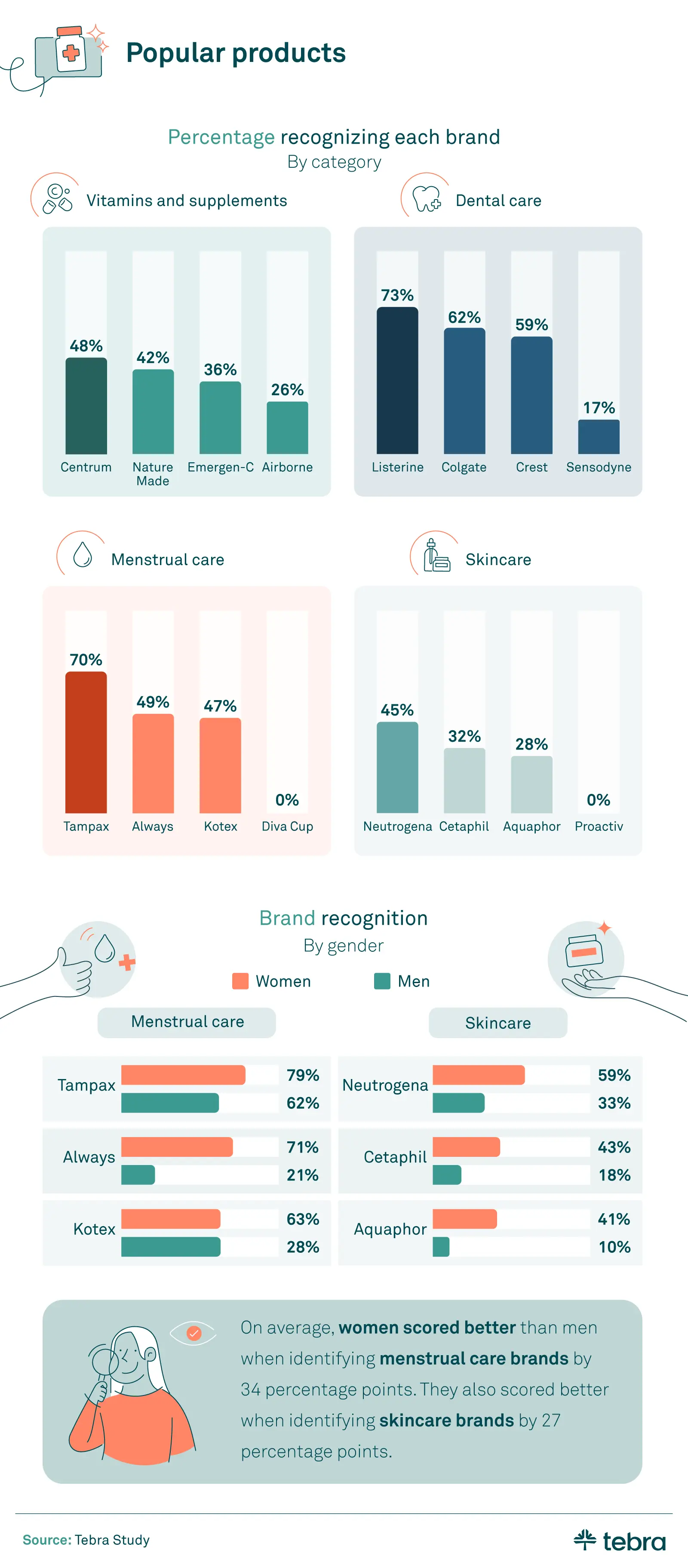
Vitamin and supplement companies may want to step up their branding game, as no brand got even half of our respondents to recognize their logo. When it came to toothpaste, Crest and Colgate were closely matched, but the block letters of Listerine’s logo proved more memorable than both.
Moving on to women's health, tampon brand Tampax had a significantly more recognizable logo than pad company Always, despite another study finding that women are about equally likely to use tampons as pads. Meanwhile, Diva Cup — a newer concept to the menstrual market — received zero recognition.
Women weren’t the only ones able to identify female product brands, though: Over half of men (62%) correctly identified the Tampax logo. However, this brand name is very similar to the product it sells. As for skincare products, women recognized those logos substantially better than men as well.
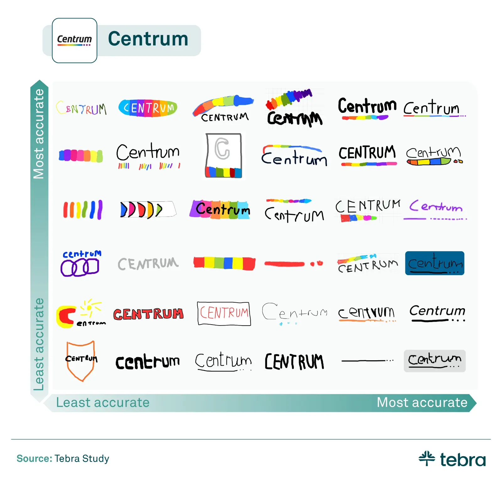
When given the Centrum brand name and prompted to draw the logo, the iconic rainbow line came through for many of our respondents. That line’s placement, though, seemed to stump many.
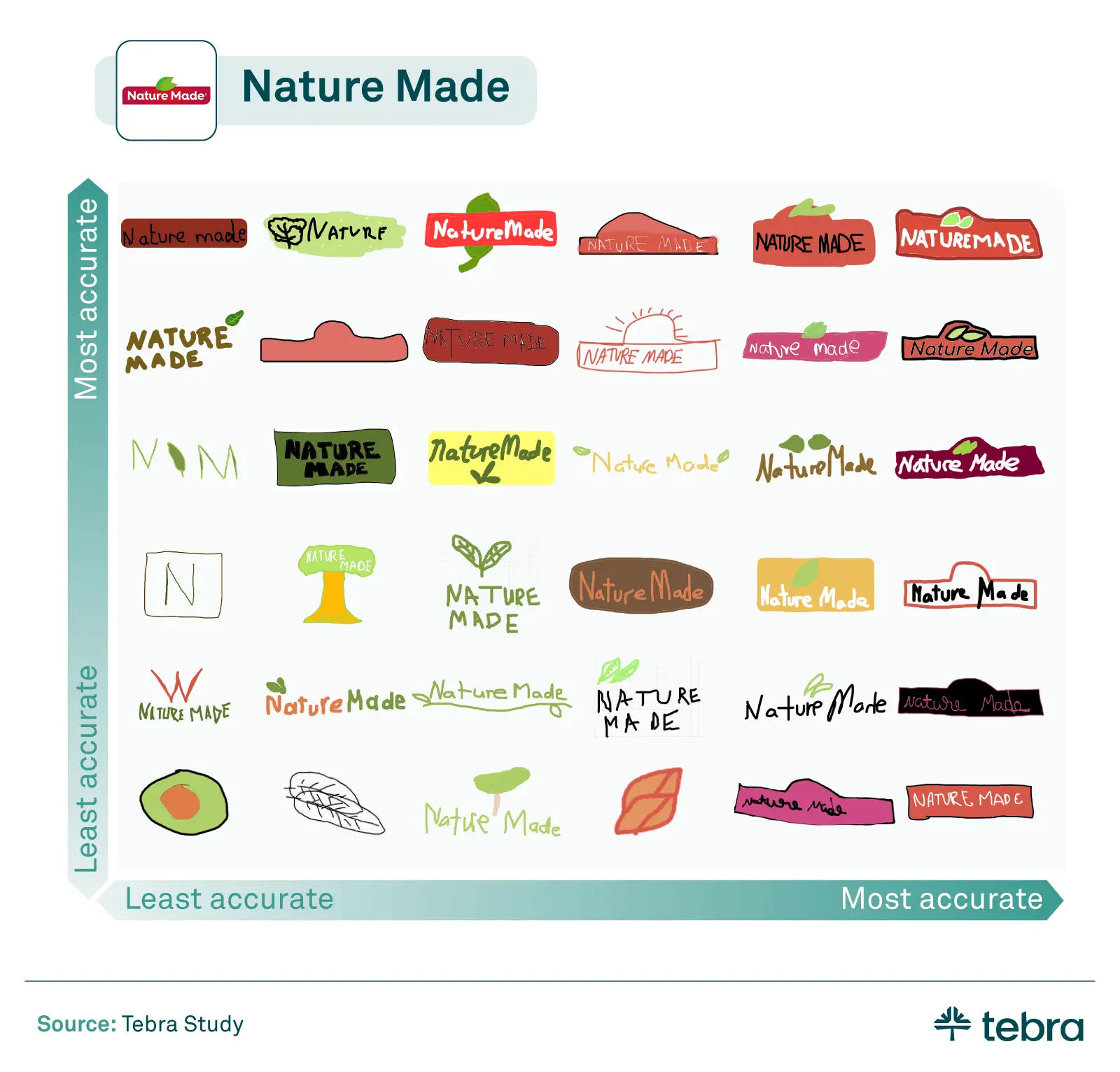
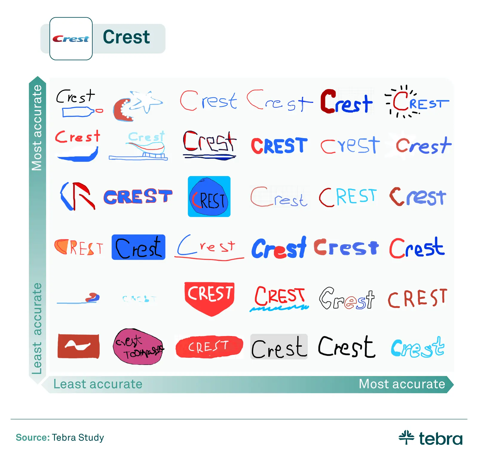
People had a much harder time with Centrum’s competitor, Nature Made. Many remembered the leaf motif but struggled with where to place it. The Crest logo’s simplicity seemed to make it one of the easiest to draw.
Popular providers
Lastly, we wanted to look at how national healthcare service providers were able to make their mark in the minds of customers and patients.
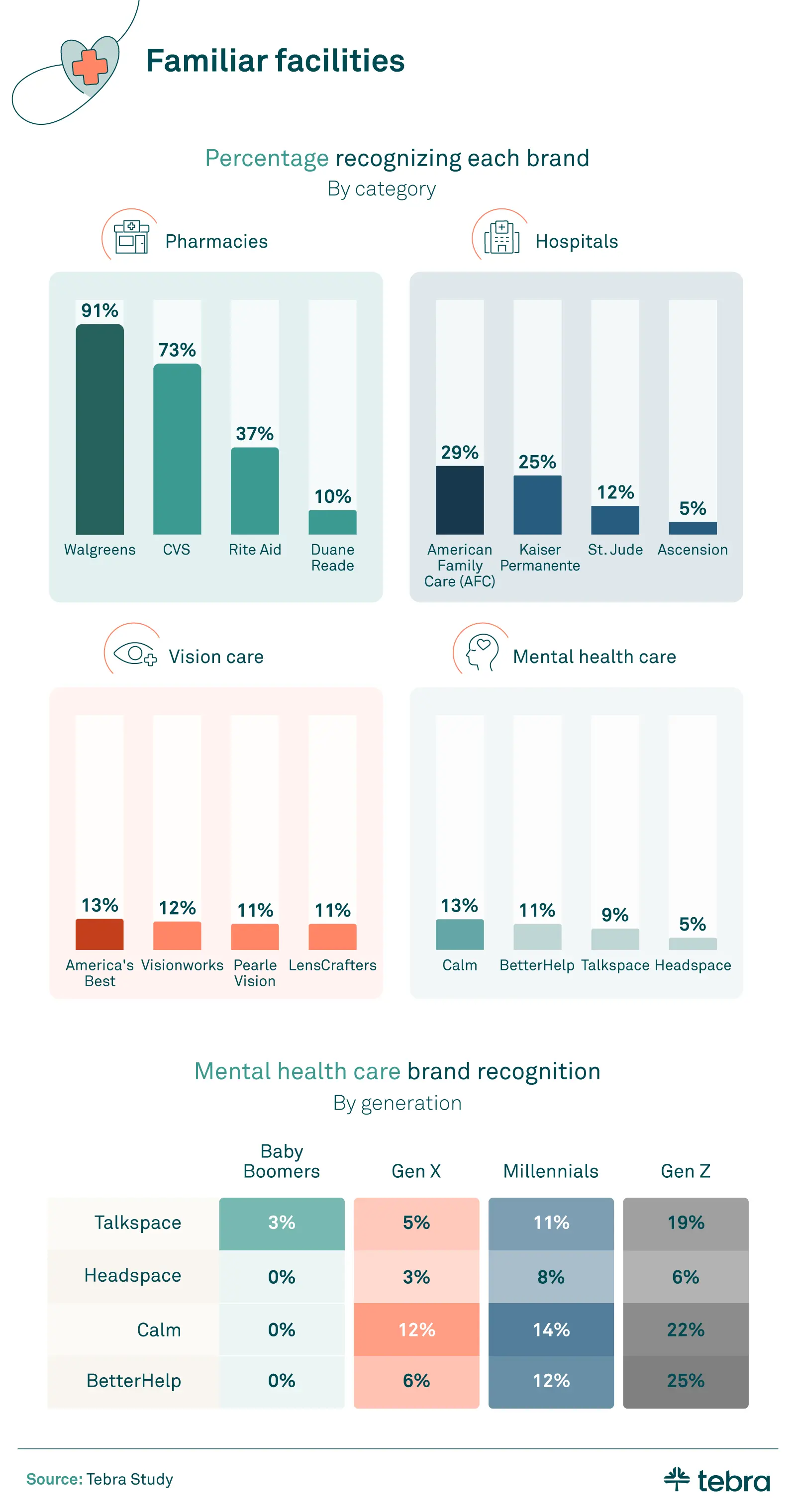
Walgreens was the most recognized pharmacy and had the most recognized logo as well. With nearly 9,000 U.S. Walgreens stores in 2023, it’s no wonder the cup with the “W” was so easy to identify.
American Family Care (AFC) had the most recognizable logo among the national hospitals and clinics.
Digital businesses seemed elusive to the older respondents. While no Baby Boomers were able to identify Calm or BetterHelp, around a quarter of Gen Z could. This may have less to do with logo design and more with the fact that Gen Z is likelier to pursue mental health treatment than Baby Boomers. Gen Z is also more likely to pursue medical help online and telehealth.
Asking respondents to draw the Rite Aid logo showed us that old branding dies hard. The following depictions were the final results of our study.
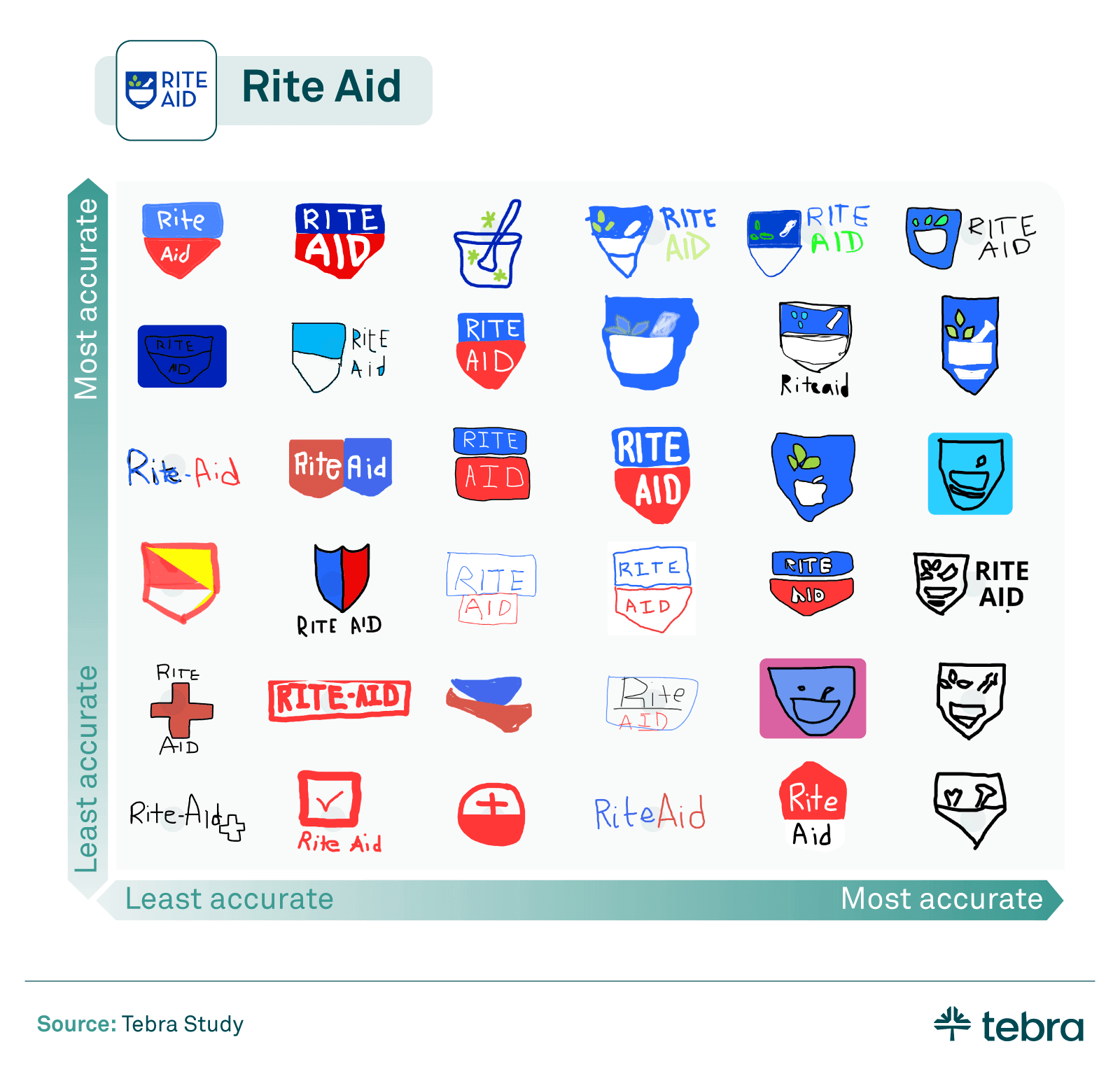
In late 2020, Rite Aid rebranded and moved away from its red and blue logo to a more intricate blue, white, and green design. But more than three years later, it appears their new look has yet to catch on with the general public. A majority of our respondents still associated Rite Aid with their simpler red and blue logo. Considering Walgreens’ simple logo was the most remembered logo of all, maybe Rite Aid should have stuck with the old design.
Branding for the healthcare market
Walgreens stood out as the most recognized logo, appealing broadly across genders and generations. As for logo memorability, Allegra’s unique purple logo may distinguish it in the allergy medication market, while Pepto Bismol’s memorable pink could set it apart in digestive health. Bayer and Rite Aid both changed their logos and color schemes over the years, and it may not be a coincidence that many people still associate them with their old branding. These findings illustrate the importance of distinctive, memorable branding in the competitive healthcare market.
Methodology
We surveyed 1,005 Americans about their ability to recognize healthcare brands. Respondents were presented with an image of the logo with the brand name obscured, as well as the category the brand was in. Among our respondents, 11% were Baby Boomers, 24% were Gen X, 53% were Millennials, and 12% were Gen Z. Regarding gender, 52% were women, 47% were men, and 1% were nonbinary or nonconforming.
Additionally, we asked 111 respondents to draw six healthcare logos from memory using sketch.io/sketchpad and send us their drawings.
About Tebra
In 2021, with a combined mission to unlock better healthcare, Kareo and PatientPop joined forces to form Tebra — a complete practice automation solution for independent healthcare providers. With an all-in-one, purpose-built platform to drive practice success and modernize every step of the patient journey. To learn more about how Tebra is committed to improving patients’ and providers’ success and well-being, visit www.tebra.com.
Fair use statement
Interested in testing your friends on healthcare brand knowledge? Feel free to share our study; we just ask that you do so for non-commercial purposes and link back to this page.